
4 min read
Mobile Friendly Dental Website: Stop Losing New Patients
Stop losing leads to slow load times and clunky menus. Discover how to optimize your clinic's mobile experience for higher conversion rates.
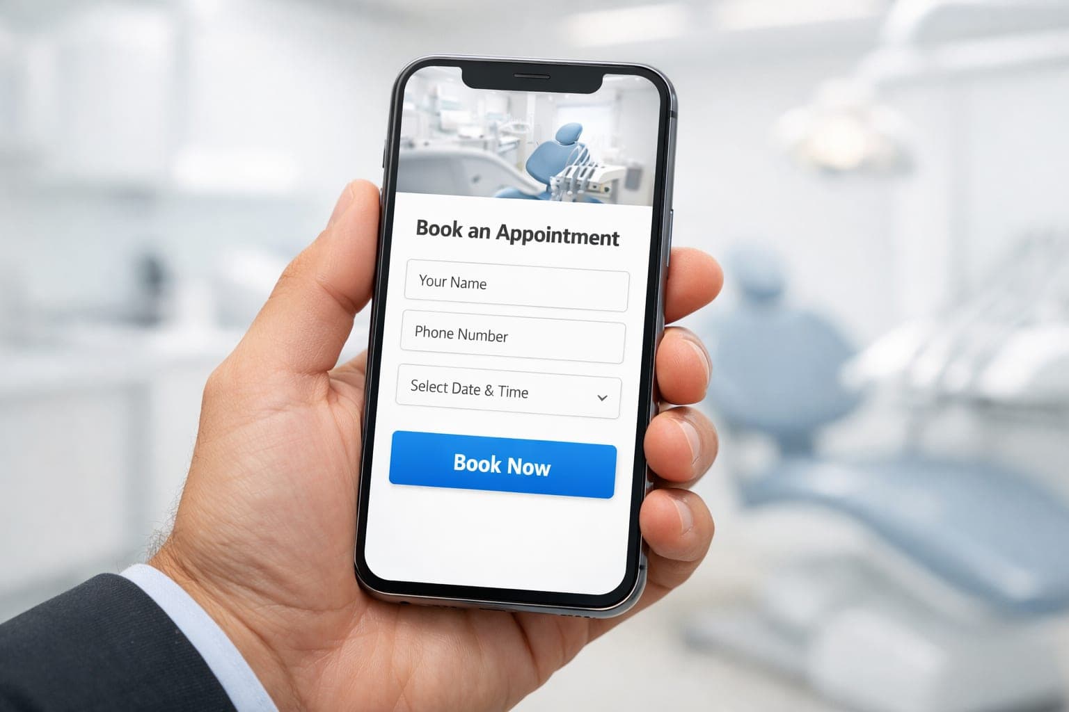
Most of your new patients are not sitting at a desk when they decide to book a cleaning or whitening. They are in the car, waiting for coffee, or scrolling during a quick break. Having a mobile friendly dental website is not a bonus; it is how your clinic is judged before a patient ever talks to your receptionist.
Key takeaways
- Design for the "errand booker" who needs speed and minimal effort.
- Place primary calls to action in the "thumb zone" for easy access.
- Reduce booking form fields to prevent lead abandonment.
- Prioritize page speed and image compression to lower bounce rates.
- Use swipeable galleries and star ratings for quick trust validation.
Why does my dental website need to be mobile friendly?
Patients booking on a phone have different constraints than desktop users. They have limited time, short attention spans, and usually only one hand free. This is the psychology of the "errand booker." They want to solve a problem fast, and if they hit a wall of text or a complex menu, the mental effort to find the booking button becomes too high.
When a user bounces from your site, they rarely changed their mind about the treatment. Instead, the friction of the interface outweighed their desire for the service. To keep these leads and improve your patient acquisition, you must design for speed and minimal effort.
If your site is difficult to navigate on a phone, you are effectively sending potential patients to your competitors. A seamless mobile UX ensures that the path from a Google search to a confirmed appointment is as short as possible.
Designing for the Thumb Zone
Most people hold their phones with one hand and navigate with their thumb. The top left corner is the hardest spot to reach. If your booking button or phone number is hidden in a hamburger menu at the top, you have built a physical barrier between you and the patient.
To optimize for thumb reach and improve your overall web design, follow these rules:
- Put your primary call to action (CTA) in a sticky footer. This keeps the "Book Appointment" button reachable no matter how far they scroll.
- Use large, tappable buttons. Small text links are frustrating and lead to accidental clicks.
- Center your most important forms. Do not put critical input fields at the very edges of the screen.
- Use a click to call button. A patient should be able to start a call with one tap instead of copying and pasting a number.
Proper button placement is critical for growth. For more tips on this, read about dental website booking button placement to see where your CTAs should live.
How do I stop patients from abandoning my booking form?
Long intake forms kill conversions. Asking for a full medical history, insurance details, and a detailed reason for the visit on a mobile screen is a mistake. Every extra field increases the chance a user will quit.
Use a tiered approach for a high converting mobile experience. Your initial booking form should only ask for:
- Name
- Phone number
- Preferred date or time
Your staff can handle the medical history and insurance via phone or a follow up email once the lead is captured. If you must gather more data upfront, use a multi step form. This breaks the process into small chunks that do not feel overwhelming on a small screen.
If your current site feels clunky or slow, GenXTech Solutions can help you rebuild for better conversions. We specialize in clinic and med spa website design services that prioritize the user journey.
Speed and the First Impression
Mobile users have no patience. A delay of two or three seconds can tank your conversion rates. This usually happens because of oversized images or heavy scripts that a mobile browser cannot process quickly.
To fix your speed, focus on these technical changes:
- Compress all images. High resolution photos of your clinic look great, but they should be in modern formats like WebP to keep file sizes small.
- Minimize redirects. Every time a page redirects, it adds a delay the user will notice.
- Prioritize "Above the Fold" content. Your location and booking button should load instantly.
Your site must load fast because the first few seconds determine if a patient stays. Learn more about how to win patients in 3 seconds by optimizing your first impression.
Building Trust on a Small Screen
Trust signals change on mobile. A desktop user might read your entire "About Us" page, but a mobile user wants quick validation. They need to know you are professional without scrolling for minutes.
Use these trust shortcuts to improve your dental marketing:
- Star ratings. Put a summary of your Google reviews directly under the main header.
- Before and after galleries. Use a simple swipe carousel instead of a long vertical list.
- Clear pricing. Using "Starting at" labels reduces the anxiety of booking an unknown cost.
- Professional imagery. Skip the generic stock photos. Real photos of your staff and office build immediate credibility.
The Booking UX Flow
Review your current booking flow. Start at the Google search result and try to book an appointment using only your thumb. Note every time you have to zoom in, every time a pop up blocks your view, and every time you have to type more than is necessary.
An ideal flow for a mobile friendly dental website looks like this:
- Search result
- Landing page with sticky "Book" button
- 3 field form
- Confirmation page
Anything that deviates from this path is a point of failure. If you are running a med spa, you can apply similar logic to your treatment landing page conversion strategies to ensure high lead quality.
Next step
Your website should be your hardest working employee, capturing leads while you focus on your patients. If your site is not optimized for the mobile errand booker, you are leaving revenue on the table. Contact us to build a high performing practice website that converts visitors into patients.
Frequently asked questions
What is the most important element of a mobile dental website?
The most important element is a clear, easy to reach call to action. A sticky "Book Now" button that remains visible as the user scrolls ensures they never have to search for a way to contact you.
How many fields should a mobile booking form have?
You should keep initial mobile forms to 3 or 4 essential fields. Reducing friction prevents users from abandoning the page, while your staff can collect detailed medical history later.
Does page speed really affect dental clinic bookings?
Yes, speed is critical for patient acquisition. Mobile users often book between errands and will quickly leave a site that takes too long to load in favor of a faster competitor.
What is the "thumb zone" in web design?
The thumb zone is the area of a smartphone screen that is easily reachable with one hand. Placing critical buttons in this zone reduces physical effort and increases the likelihood of a booking.
Should I use stock photos on my mobile site?
No, you should use real photos of your staff and office. Authentic imagery builds immediate trust and credibility with mobile users who are looking for quick validation of your professionalism.