
6 min read
Multi Location Dental Website: Navigation Tips for Clinics
Discover how to build a multi location dental website with clear navigation, effective location pages, and seamless booking UX to drive more patient appointments.
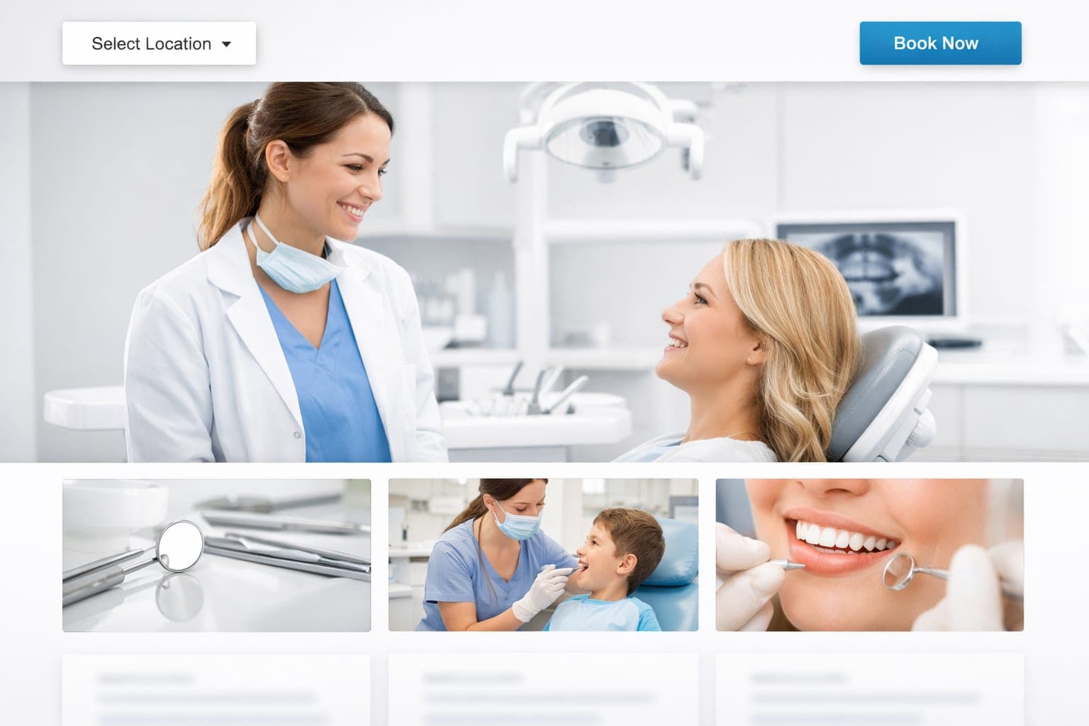
Patients searching for a dentist often start on your website, and they expect to find the nearest office quickly. A multi location dental website must guide visitors to the right location without hiding the booking button. Clear navigation and prominent appointment links help patients find the right office and book their visit without any confusion.
Key takeaways
- Use a simple locations dropdown in the header so patients can pick an office in one click. Ensure it is keyboard accessible and includes appropriate ARIA labels.
- Keep the booking button visible in the header and on every location page.
- Give each office its own page with unique NAP, map, photos, and service list.
- Optimize each location page for local search with schema and localized content.
How should I structure location pages for a multi location dental website?
Each office needs a dedicated URL that contains its name, address, phone number, and hours. Start with a clean pattern such as /locations/office-name or /locations/city. For SEO friendly URLs, use hyphens to separate words, keep all letters lowercase, and avoid special characters or numbers that could confuse search engines. This helps search engines understand that each page is unique and prevents duplicate content issues.
To make these pages work, you need to provide specific, localized data. This is not just for the patient, but for the algorithms that decide who shows up in the local map pack. When a patient lands on a location page, they should immediately feel like they are looking at the specific office they intend to visit, rather than a generic corporate template.
- Add the NAP details in schema markup so Google can verify your information.
- Include an embedded Google Map with the pin placed exactly at the office.
- Write a short paragraph that highlights what makes that location special, such as a specific technology or a unique service.
- Show real photos of the waiting area, treatment rooms, or friendly staff to create a personal connection.
- Feature a patient review that mentions the office by name.
- List the services offered at that site, especially if they differ from your other locations.
When you list these services, ensure they are descriptive. If one office focuses more on cosmetic work while another handles emergency surgery, make that clear. This prevents the frustration of a patient booking an appointment only to find out the specific treatment they need is not available at that branch.
What are the best practices for booking UX on a multi location dental website?
The booking button should stay visible no matter where the visitor scrolls. A fixed header button works well on desktop and mobile, ensuring the call to action is always within reach. If a patient has to scroll back to the top of a long location page to find the appointment link, you are creating a barrier to entry.
- Place a “Book Appointment” button in the header that remains fixed as the user scrolls.
- Test that the fixed button does not obscure content on small screens; consider adding an offset or using conditional sticky behavior that hides the button when it would cover essential information.
- Repeat the button at the top and bottom of every location page for users who prefer to scroll through the content first.
- Use a brand consistent color that contrasts with the background for easy spotting.
- Direct the button to your scheduling software without extra landing pages or pop ups.
A seamless booking experience is the difference between a lead and a patient. You want the transition from "I need a dentist" to "I have an appointment" to be as fast as possible. This means minimizing the number of clicks required to reach the calendar.
For additional placement ideas see: Dental Website Booking Button: 5 Best Placements for Growth.
Designing clear website navigation for multiple offices
A simple locations dropdown in the main menu keeps the menu clean. Avoid vague labels like “Our Offices” unless you pair them with a visible selector that tells the user exactly what to expect when they click.
- Put a “Locations” item in the top menu that opens a dropdown or mega menu showing every office name.
- To prevent overload, limit the dropdown to the top five offices (by patient volume or geographic importance) and add a “View all locations” link at the bottom of the menu that leads to a full directory page.
- Keep each label short and use the office city or neighborhood name.
- Ensure patients can reach a specific location page in two taps or fewer from the homepage.
- Add a “Find Your Nearest Office” button or map on the homepage for quick access.
- Use breadcrumbs on location pages (Home > Locations > Office Name) so users can jump back easily.
Navigation is about reducing the cognitive load on the patient. When someone is in pain or stressed about a dental emergency, they do not want to solve a puzzle to find your phone number. The path to the location page should be intuitive and immediate.
Creating high value content for location pages
Unique content strengthens local relevance and helps each office stand out. Many clinics make the mistake of copying and pasting the same text across five different pages, simply swapping the city name. This is a mistake that can hurt your SEO rankings because search engines view it as duplicate content.
Instead, focus on the unique attributes of each site. Does the downtown office have free parking? Does the suburban office have a kid friendly waiting room? Does one location have a specific specialist who only works on Tuesdays? These details provide value to the patient and signal to Google that the page is genuinely useful.
To ensure your content is effective, follow these guidelines:
- Use local landmarks in your descriptions to help patients orient themselves.
- Highlight the specific dentists who practice at that location.
- Include a "Frequently Asked Questions" section specific to that office, such as parking tips or insurance accepted at that site.
- Use high resolution, original imagery. Stock photos of a generic office do not build trust; photos of your actual staff do.
If you are updating your site to better reflect these local nuances, you might be considering a broader refresh. In that case, check out this guide on Dental Website Redesign SEO: Keep Your Rankings While You Refresh to ensure you do not lose your current traffic while improving the user experience.
Technical considerations for fast loading and dental SEO
The back end of your site must keep location pages quick and error free. A slow site leads to high bounce rates, meaning patients will leave your site and click on the next dentist in the search results.
- Use a clean URL pattern like /locations/office-name.
- Apply local business schema to each page to give search engines exact geo coordinates.
- Use canonical tags to tell search engines which version of a page is the "master" copy. This prevents the site from being penalized if you have multiple URLs leading to the same content.
- Compress images and enable browser caching to improve load speed.
- Test the site on a phone to confirm the booking button is thumb friendly and the menu opens smoothly.
Mobile optimization is non negotiable. Most local searches happen on a smartphone while the user is on the go. If your location page takes five seconds to load or the map is hard to interact with on a touch screen, you are losing patients.
GenXTech Solutions builds websites that follow these principles, helping clinics keep their sites fast and search friendly. We focus on the intersection of technical performance and patient psychology to ensure your digital presence actually grows your practice.
Next step
A structured multi location dental website makes it easy for patients to pick an office and book a visit. If you want to stop losing leads to competitors with better websites, let us help you optimize your patient journey. Contact us to book your website growth consult
Frequently asked questions
How many location pages should we create for a practice with three offices?
Create one dedicated page for each office. Each page should have its own URL, unique NAP details, and localized content to support local search and avoid duplicate content issues.
Should the booking button appear in the main navigation or only on location pages?
The booking button should be present in the site header on every page, including the homepage and location pages, so it is visible regardless of where the visitor is in the site.
What is a simple way to test if location pages are easy to find on mobile?
Open the site on a smartphone, start from the homepage, and count how many taps it takes to reach a specific location page. Aim for two taps or fewer, and verify the booking button stays reachable without zooming.
How can schema markup improve the performance of location pages?
Adding local business schema to each location page gives search engines precise information about the name, address, phone, and geo coordinates, which can boost visibility in local search results. Here is a concrete JSON LD example you can copy and adapt for each office:
Why is it important to have unique photos and reviews for each office location?
Unique photos and location specific reviews create a personal connection for patients, signal relevance to search engines, and help differentiate each office in a multi location practice.