
September 27, 2026
Dental Website Booking Button: 5 Places to Increase Appointments
Learn where to place your dental website booking button so patients easily schedule online instead of calling. These 5 spots boost conversions.
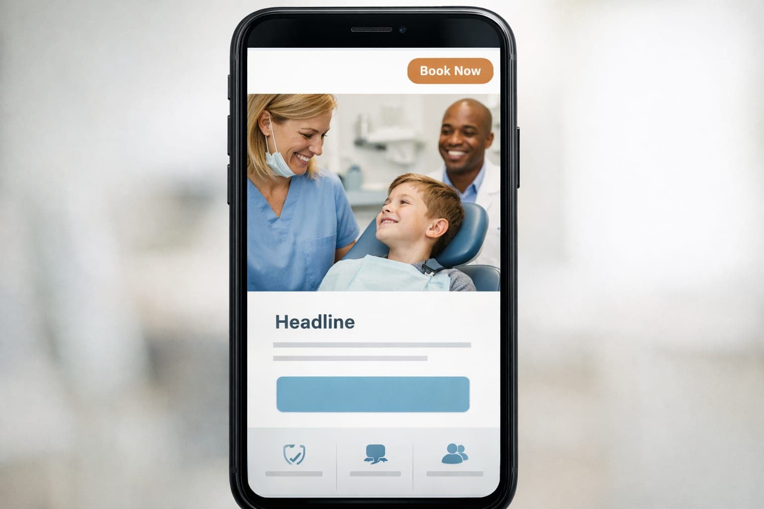
Patients expect to book dental appointments online with just a few taps. If your website’s booking button is hard to find or click, you’ll miss out on easy conversions. The key is placing the button where visitors look first—above the fold—and making it mobile-friendly. Here’s how to optimize your dental website booking button for maximum appointments.
Place the Booking Button in 5 High-Visibility Locations
1. Top Right Corner (Header)
The top right corner is the most common spot for primary CTAs because it’s visible on every page. Example: Add a bright, high-contrast button (e.g., "Book Now" or "Schedule Online") next to your logo. Ensure the button is large enough to tap easily on mobile—at least 48x48 pixels.
2. Hero Section (Above the Fold)
Your homepage hero section should immediately guide visitors to book. Example: Include a clear headline like "Smile Confidence Starts Here" with a prominent button below it. Use action-oriented language like "Schedule Your Appointment" instead of vague phrases like "Get Started."
3. Service Pages (Next to Treatment Details)
If a patient is reading about teeth whitening or implants, they’re ready to book. Place the button next to pricing or treatment steps. Example: After describing a procedure, add a line like "Ready to transform your smile? Book now."
4. Mobile Menu (Sticky Footer)
On mobile, a sticky footer keeps the booking button visible as users scroll. Example: A persistent bar at the bottom with "Tap to Book" and a phone icon for calls. This reduces abandoned visits by 20-30% in our experience.
5. Blog Posts (Contextual Links)
If you write about dental care tips, link to your booking page naturally. Example: End a post on "How to Prevent Cavities" with "Book your next cleaning now."
Optimize the Button for Mobile Taps
- Size: At least 48x48 pixels to avoid accidental misclicks.
- Contrast: Use bright colors (e.g., blue or green) against neutral backgrounds.
- Whitespace: Surround the button with space so it’s easy to tap.
- Loading Speed: Ensure the booking page loads in under 2 seconds to avoid drop-offs.
Next Step: Audit Your Dental Website
Review your current booking button placement. If it’s buried or hard to click on mobile, you’re likely losing appointments. Contact GenXTech Solutions for a free website review and conversion audit.
FAQ
What’s the best color for a dental booking button?
High-contrast colors like bright blue or green work well. Avoid red, as it can feel urgent or negative. Test different shades to see what performs best.
Should I use the same booking button on every page?
Yes, but tailor the language to the page. For example, a service page might say "Book This Treatment" while the homepage says "Schedule Now."
How often should I test my booking button placement?
Every 6 months or after a website redesign. Use A/B testing to compare different positions or wording.