
5 min read
Clinic Website First Impression: Win Patients in 3 Seconds
First impressions happen in three seconds. Discover how to optimize your clinic's digital front door to build trust and increase bookings.
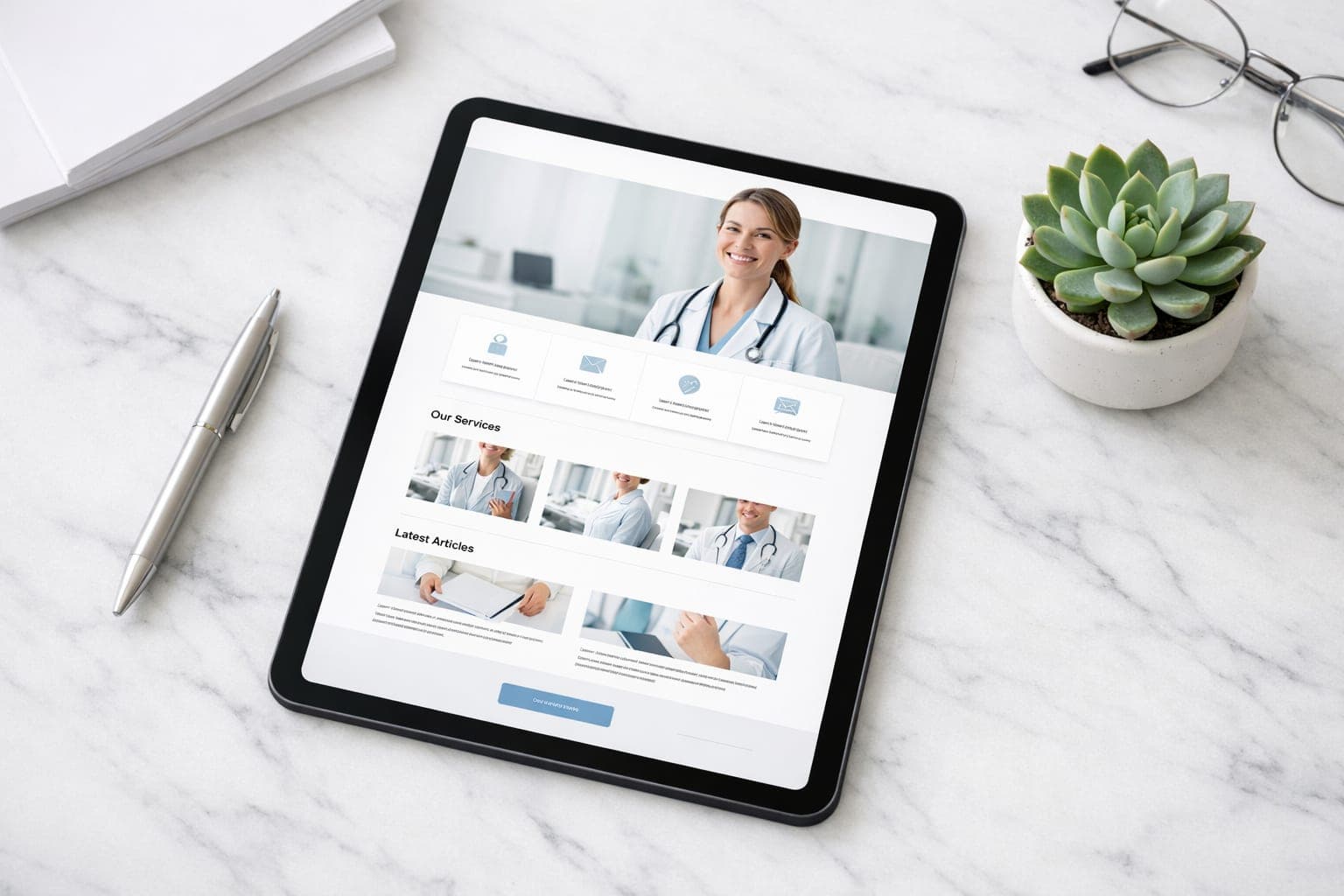
A potential patient decides whether to trust your practice in about three seconds. This clinic website first impression determines if they book an appointment or hit the back button to find a competitor. For dental clinics and med spas, trust and visual professionalism are the primary drivers of patient acquisition.
Key takeaways
- Patients need to know what you do, why they should trust you, and how to book immediately.
- Original photography outperforms stock images for building medical trust.
- Above the fold content must feature a specific value proposition and a clear call to action.
- Mobile optimization and streamlined booking flows are critical for conversion rate optimization.
Why does the three second rule matter for patient trust?
Patients land on your site looking for specific answers. If they encounter friction, they leave. To win a patient over instantly, your site must answer three questions the moment the page loads:
- What do you do? (Clarity of service)
- Why should I trust you? (Proof of quality)
- How do I get started? (Ease of access)
Many practices waste this window with generic greetings like "Welcome to our Practice" paired with stock photos of random smiling people. These do not build trust. Instead, use specific value propositions. A med spa should place its most popular treatment and its unique approach to skin health front and center to capture attention.
How can I improve my clinic web design for better trust?
In the health and beauty industry, the aesthetic of your website is a proxy for the quality of your clinical work. If a website looks like it was built a decade ago, patients often assume the medical equipment is just as outdated.
To build immediate authority, focus on these visual trust signals:
Authentic Imagery
Put away the stock images. Use high resolution original photography of your actual office, your staff, and your real patient results. Patients want to see the exact room where they will be treated and the faces of the people treating them.
Layout and Aesthetics
A cluttered site suggests a cluttered practice. Use clean white space and generous padding between sections to make content easy to scan. Stick to professional color palettes that evoke calm and cleanliness, such as soft blues, whites, or muted neutrals. Avoid neon colors that distract from the medical nature of the work.
Technical Performance
Fast loading speeds are a part of Medical UX. A slow site suggests poor management. If a patient is checking your site on a mobile device during a lunch break and it takes five seconds to load, the impression is negative before they see a single image.
Maximizing the above the fold offer
The area visible before a user scrolls is your most valuable digital real estate. This is where your primary offer and call to action (CTA) must live to maximize conversion rate optimization.
Avoid vague buttons like "Contact Us." Instead, use action oriented language that tells the patient exactly what happens next:
- Book Your Consultation
- Claim Your New Patient Offer
- Schedule a Skin Analysis
Your headline should state the specific benefit of choosing your clinic. A dental practice should move away from "Quality Dental Care" and toward "Restore Your Smile with Pain Free Implant Dentistry." This tells the patient exactly what you do and what the outcome will be.
If your current site is not turning visitors into leads, GenXTech Solutions can help you redesign your high traffic pages to attract more patients.
Optimizing the booking UX for higher conversions
Once you have captured interest, the path to booking must be frictionless. A common mistake in clinic web design is forcing patients to fill out long forms or requiring a phone call during business hours just to check availability.
Modern patients prefer autonomy. To increase your appointment rate, implement these strategies:
- Integrated booking calendars: Allow patients to see open slots in real time to eliminate the back and forth of emails.
- Minimal form fields: Only ask for essential information like name, email, phone, and the desired service. Every extra field reduces the likelihood of completion.
- Mobile first design: Most patients search for clinics on their phones. If your booking button is too small for a thumb or the form is difficult to navigate on a small screen, you will lose the lead.
For those looking to optimize specific appointment types, checking dental website booking button placement can provide further tactical advantages.
Establishing authority through social proof
Trust is not something you claim; it is something you prove. To strengthen a clinic website first impression, place social proof directly next to your booking buttons.
Effective trust signals include:
- Google Review badges: Displaying your star rating proves that other patients had a positive experience.
- Before and after galleries: For med spas and cosmetic dentistry, visual proof is the most powerful conversion tool. Organize these by treatment type for easy browsing.
- Professional affiliations: Keep logos of medical boards or industry certifications visible but subtle.
- Specific testimonials: Use short quotes about results. A quote like "My anxiety disappeared during the procedure" is far more effective than a generic "Great service" comment.
Why use landing pages for specific treatments?
While the homepage builds general trust, dedicated treatment pages close the deal. If a patient clicks an ad for "Teeth Whitening," sending them to the homepage creates unnecessary friction. They should land on a page dedicated solely to that service.
A high converting treatment page should include:
- A specific headline that addresses the patient's pain point.
- A clear explanation of the procedure and its benefits.
- A gallery of results specific to that treatment.
- An FAQ section covering common fears or costs.
- A direct booking link for that specific service.
This focused approach removes distractions and leads the patient toward a single decision. You can learn more about why single treatment med spa pages outperform services dumps to refine your strategy.
For more tips on growing your practice, visit our blog or explore our clinic and med spa website design services.
Next step
Your website is your digital front door. If it does not communicate trust and clarity in seconds, you are losing revenue to competitors with better sites. Whether you need a full practice redesign or a high converting landing page, GenXTech Solutions specializes in medical UX that turns visitors into patients. Contact us to start your optimization.
Frequently asked questions
What is the most important element for a clinic's first impression?
The most important element is clarity. A visitor must instantly understand what services you offer, why you are qualified, and how to book an appointment without having to search for the information.
Should I use stock photos to make my clinic look more professional?
No. Original photos of your actual staff, equipment, and office build significantly more trust than stock imagery, which can feel impersonal or dishonest to a potential patient.
How does page speed affect patient acquisition?
Slow loading speeds create immediate frustration and suggest a lack of attention to detail. If a site takes too long to load, visitors often assume the practice is outdated and will return to the search results.
What is the best call to action for a medical website?
The best CTAs are action oriented and benefit driven. Instead of "Contact Us," use phrases like "Book Your Consultation" or "Schedule Your Skin Analysis" to tell the patient exactly what the next step is.
Why are dedicated treatment pages better than a single services list?
Dedicated pages allow you to address specific patient fears and show relevant before and after results. This removes distractions and increases the conversion rate by focusing on one specific need.