
19 min read
Med Spa Website Design That Converts More Patients
Med spa website design should do more than look polished. Learn how to build pages that support booking, trust, and local SEO.
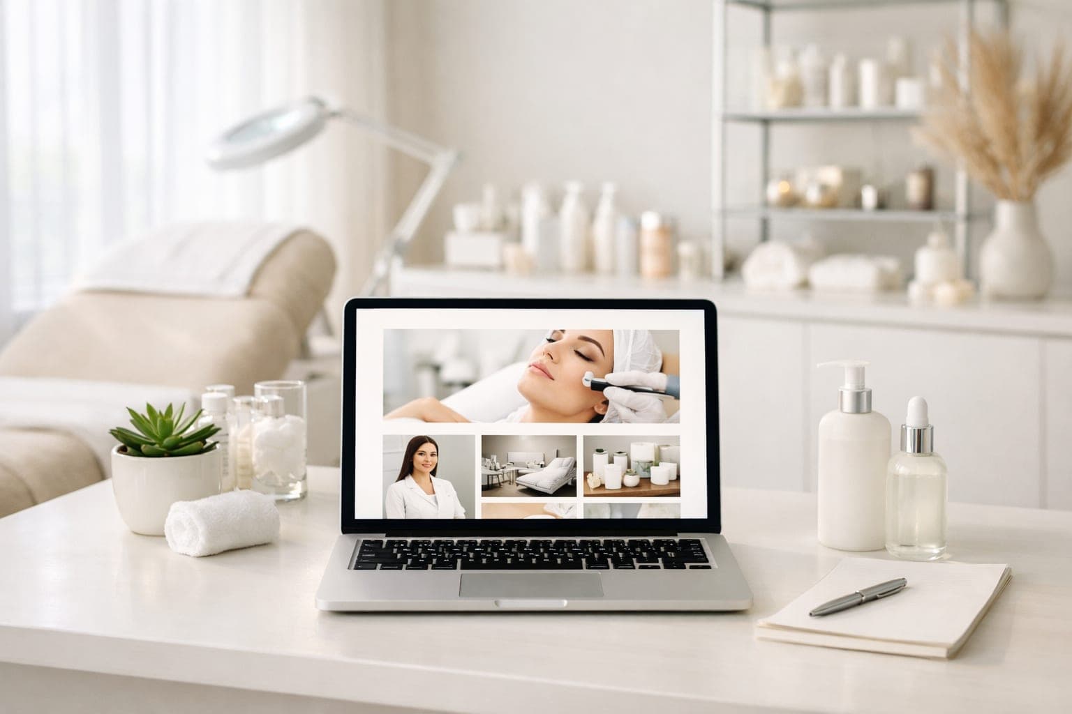
A strong med spa website design helps turn search traffic into booked consultations by making it easy to trust your practice, understand your services, and take the next step. For most aesthetic practices, the website should do more than look polished. It should guide visitors to treatment pages, memberships, before‑and‑after photos, and booking in a way that feels simple and credible.
When you are building or redesigning a site for a med spa, the goal is not just a prettier homepage. The goal is a website that answers patient questions quickly, supports local search visibility, and gives every high‑value service its own path to conversion. That means clear navigation, dedicated landing pages, strong calls to action, mobile‑friendly booking, and trust signals that help people feel confident reaching out.
Key takeaways
- Med spa websites convert better when they make services, trust signals, and booking easy to find.
- Dedicated treatment pages and landing pages help match search intent and improve conversion.
- Local SEO, mobile usability, and fast load times all support more bookings.
- Before‑and‑after galleries, provider bios, and clear policies help build trust.
- A strong site should guide patients from search to consultation with as little friction as possible.
What med spa website design needs to do
A med spa website must educate, reassure, and convert in a single visit. Most visitors are not ready to book the moment they land on your site. They want to know what you offer, whether your team is qualified, what results might look like, and how to schedule an appointment without friction. Good design supports each of those steps.
At a minimum, your site should:
- Make services easy to find
- Explain treatments in plain language
- Show real proof of work through photos, reviews, and provider bios
- Reduce booking friction on mobile
- Give each major service its own optimized page
- Build trust with consistent branding and clear policies
A site that does these things well usually performs better than one that relies on a generic homepage and a single services page. Think about a patient checking her phone at lunch. She searches “Botox near me,” clicks your link, and has about thirty seconds before a meeting starts. If she cannot find pricing, provider info, or a booking button in that window, she moves on. Your site needs to work for that person.
A good med spa website design also supports the way people actually browse. Some visitors are ready to compare injectables. Others want to see a gallery first. Others only need a quick way to call or book. The site should give each of those visitors a clear next step instead of forcing everyone down the same path.
How to structure a med spa website
A clear site structure helps visitors find the right treatment faster and helps search engines understand your content. For med spas, the best structure is usually built around a few core page types:
- Homepage
- About page
- Services overview page
- Individual treatment pages
- Treatment landing pages for priority services
- Membership page
- Before‑and‑after gallery
- Reviews or testimonials page
- Contact and booking page
- FAQ pages or sectioned FAQs
The homepage should introduce the practice and route visitors to the most important services. The individual treatment pages should do the heavy lifting for search and conversion. The booking page should be simple, visible, and accessible from every major page.
If your site has many treatments, organize them into categories such as injectables, laser treatments, skin rejuvenation, body contouring, and facials. This makes the experience easier for patients and keeps the site from feeling cluttered. A two‑chair practice with six core services might only need a handful of pages. A larger clinic with fifteen treatments across three locations needs a deeper hierarchy. Match the structure to the reality of your practice.
A thoughtful structure also makes future marketing easier. When your pages are grouped logically, it is simpler to launch ads, add new treatment pages, and expand local SEO without rebuilding the entire site later. If you want a broader view of how a clinic or med spa site should be planned, see our Med Spa Website Design | Custom Sites for Medical Spas for the kind of structure we build around patient behavior and conversion.
Build treatment pages that answer real patient questions
Treatment pages are where most med spa conversions begin, because they match what people are actively searching for.
A good treatment page should explain one service clearly and help the reader decide whether it is right for them. Avoid thin pages that only list a few bullet points. Instead, include the details people usually want before they book.
Each treatment page should cover:
- What the treatment is
- Who it is for
- Common concerns it addresses
- How the appointment works
- Expected downtime or recovery, if any
- How many sessions are typically needed, if applicable
- Who performs the treatment
- Frequently asked questions
- A clear call to action to book or inquire
Keep the language patient‑friendly. Many visitors are comparing options, not looking for clinical jargon. Short paragraphs, scannable headings, and simple explanations usually work best. Write the way you would explain it to someone sitting across from you in the consult room.
Treatment pages should also support conversion by reducing uncertainty. If a patient is worried about pain, downtime, or whether the treatment is right for her skin type, answer that on the page. If the page only says “learn more,” it is not doing enough work. The best pages feel like a helpful pre‑consultation conversation.
If you want a deeper breakdown of conversion‑focused treatment pages, see our guide to Med Spa Treatment Landing Page: Boost Your Conversions, which covers page structure, messaging, and booking‑focused layout.
What to include on every treatment page
A strong treatment page usually has the same core elements, even if the service changes.
- A clear headline that names the treatment
- A short intro that explains the benefit
- A simple overview of the procedure
- A section on who the treatment is for
- A section on what to expect during the visit
- A booking or consultation button
- FAQs that remove hesitation
You do not need to write a long essay. You need to answer the questions that stop people from booking. If your patient can scan the page and quickly understand the service, the page is doing its job.
Create landing pages for your highest‑value services
Landing pages are focused pages designed to convert one specific type of visitor.
Not every med spa service needs a separate landing page, but your most important services usually do. This is especially useful for injectables, laser services, and seasonal promotions. A landing page gives you more control over the message, the offer, and the call to action.
A strong med spa landing page usually includes:
- A clear headline tied to the service
- A short explanation of the benefit
- A prominent booking button or consultation form
- Trust signals such as provider credentials and reviews
- Relevant before‑and‑after photos, when appropriate
- FAQs that reduce hesitation
- A simple layout with minimal distractions
Landing pages work best when they match the intent behind the search. Someone looking for Botox, for example, does not want a generic med spa overview. They want a page that speaks directly to Botox concerns, results, and next steps. If you run a Google Ads campaign for “lip filler,” send that traffic to a lip filler page, not your homepage. The mismatch costs you leads.
This is where med spa website design becomes more than visual branding. A landing page is a conversion tool. Its job is to keep one visitor focused on one action, whether that action is booking, calling, or requesting a consultation. The more specific the page, the easier it is to write copy that feels relevant.
For a more specific example, read How to Build a High‑Converting Botox Landing Page for Your Med Spa. It shows how to structure a service‑specific page that supports both SEO and conversions.
When a landing page makes sense
A landing page is a smart choice when the service has high demand, a clear search intent, or a specific campaign behind it.
Use one when:
- You are promoting a top revenue service
- You want to improve paid ad performance
- You need a page focused on one treatment
- You want to test different offers or messages
- You need a page that is easier to measure than a broad services page
If a service matters to your schedule and revenue, it probably deserves its own page. That is especially true when a visitor is already close to booking and only needs a little more reassurance.
Make injectables pages easy to compare and trust
Injectables pages should help visitors understand the differences between popular treatments without confusion.
Many med spa patients are comparing Botox, Dysport, Xeomin, dermal fillers, and similar services. If these treatments are buried in one long page, visitors may leave before they find what they need.
A better approach is to create separate pages or clearly segmented sections for each injectable. Each page should explain:
- What the injectable is used for
- Common treatment areas
- Typical appointment experience
- How long results may last, depending on the product and patient
- Whether a consultation is needed
- Any important pre‑visit or post‑visit guidance
You do not need to overload the page with technical detail. Focus on helping the patient understand the service and feel comfortable taking the next step. A patient researching “Dysport vs Botox” wants a quick comparison table, not a pharmacology lecture. Give her the practical differences: onset time, diffusion, typical unit count, price range.
Also make sure your injectables pages include a visible path to booking. If someone is ready to ask questions or schedule a consultation, they should not have to hunt for the contact form. Put a “Book Consultation” button in the hero section, another mid‑page, and a third at the bottom. Reduce the friction at every scroll depth.
If you offer multiple injectables, the page layout should help people compare them without feeling overwhelmed. A short intro, a few clear sections, and a strong call to action usually work better than a dense wall of text. This is one of the easiest places to improve conversion because the visitor already has intent.
Use before‑and‑after galleries the right way
Before‑and‑after galleries can be one of the strongest trust builders on a med spa website when they are organized, consistent, and easy to browse.
Patients want to see realistic results. A gallery helps them picture outcomes and understand the range of work your practice performs. But the gallery should be more than a grid of photos. It should be a usable page that supports decision‑making.
Best practices for a med spa gallery include:
- Group photos by treatment type
- Use consistent lighting and framing when possible
- Add short captions that identify the service
- Keep the gallery easy to view on mobile
- Link each gallery category to the relevant treatment page
- Avoid clutter that makes photos hard to compare
Be careful with testimonials and endorsements on the site as well. If you use patient reviews or quotes, make sure they are presented honestly and in a way that aligns with FTC guidance on endorsements and testimonials. See the FTC’s Endorsement Guides for reviews and testimonials for general guidance.
For a more detailed approach, visit Med Spa Before and After Website Tips for More Bookings. That article covers layout, labeling, and how to make galleries support conversions instead of distracting from them.
Patient consent reminder, Ensure you have signed patient consent forms for all gallery photos, in compliance with HIPAA and state privacy rules.
A gallery can also support local trust. Patients often want to know whether your work looks natural, whether your team handles a range of treatment types, and whether the results fit the style they want. A well‑organized gallery answers those questions before the first call.
Add a membership page that explains value clearly
Memberships can help med spas improve retention and encourage repeat visits, but only if the offer is explained clearly. Visitors should immediately understand what is included, who it is for, and why it is worth joining.
A strong membership page should include:
- A short overview of the program
- What benefits are included
- How pricing works, if you choose to publish it
- Who the membership is best for
- How to enroll
- Frequently asked questions about billing, cancellations, and usage
Do not bury the membership offer in the footer or a generic services page. It deserves its own page with a focused message and a clear call to action. If your membership includes quarterly toxin treatments, a monthly facial, and 15 % off retail, say that upfront. Do not make people download a PDF to learn the basics.
Membership pages work best when they are written for clarity, not just promotion. Explain the value in plain language and show how the program fits into a patient’s routine. If the offer is confusing, people will hesitate. If it is simple, it can become one of the strongest conversion pages on the site.
If you want a page that is built for sign‑ups, see Med Spa Membership Website Page: How to Boost Conversions. It breaks down how to present the offer in a way that feels simple and valuable.
What makes a membership page convert
A membership page converts when it removes guesswork.
That means:
- The offer is easy to understand
- The benefits are visible right away
- The enrollment path is simple
- The page answers billing questions
- The page feels like a real program, not a vague discount
If your membership is a key part of retention, it should be treated like a core service page, not a side note.
Make booking obvious on every important page
Booking should be one of the easiest actions on your website.
A med spa website can look beautiful and still underperform if booking is hard to find. The best sites make the next step obvious on desktop and mobile, from the homepage to every treatment page.
Your booking experience should include:
- A visible booking button in the main navigation
- Clear contact options for questions and consultations
- Mobile‑friendly scheduling
- Short forms that do not ask for unnecessary information
- Confirmation messages that tell the patient what happens next
- Easy access to phone, email, and location details
If your booking form collects any patient health information, use HIPAA‑appropriate tools and workflows. Keep intake forms secure and only ask for what you truly need before the visit. A patient booking a HydraFacial does not need to disclose her full medical history on the website. Save that for the in‑office intake.
Also think about how many clicks it takes to book. Fewer steps usually mean fewer drop‑offs. If someone is ready to schedule, the site should not force them through a maze of pages. Test your own booking flow once a quarter. Click every button. Fill every field. Time it. If it takes more than two minutes, you are losing patients.
Booking should be visible in more than one place. Put it in the header, repeat it in the body copy, and include it at the end of important pages. If you want a deeper look at button placement strategy, see Dental Website Booking Button: 5 Best Placements for Growth. The principles translate well to med spa sites because the goal is the same: reduce friction and make the next step obvious.
Design for trust, not just aesthetics
Trust is one of the most important conversion factors in med spa website design.
Patients are often making decisions about appearance, comfort, and cost. Your website should reduce uncertainty at every step. A polished design helps, but trust comes from clear information and consistency.
Trust‑building elements include:
- Provider bios with credentials and specialties
- Real photos of the space and team
- Reviews and testimonials presented clearly
- Treatment explanations that avoid exaggerated promises
- Transparent contact information
- A professional, consistent visual style
It also helps to keep the writing calm and direct. Overly aggressive sales language can make a med spa feel less credible. The best websites sound knowledgeable, helpful, and professional. Replace “Unlock your best self today!” with “We help patients achieve natural‑looking results with personalized treatment plans.” The second version builds confidence.
Trust also comes from consistency across the site. If your homepage feels modern but your treatment pages feel generic, visitors notice. If your bio page is thin, they may wonder who is actually performing the treatment. If your contact details are hard to find, they may assume the practice is less responsive than it is. Small gaps in trust can cost you bookings.
If you are working with a marketing partner or website provider, make sure they understand how med spa buyers behave online. Our article on Med Spa Marketing: How to Hire the Right Growth Specialist can help you evaluate that relationship before you commit.
Trust signals that matter most
The strongest trust signals are the ones that answer real concerns quickly.
Focus on:
- Who performs the treatment
- What results patients can expect
- How the practice communicates
- Whether the site feels current and professional
- Whether the booking process feels safe and simple
When those pieces are clear, patients are more likely to move forward.
Use local SEO basics to help the right patients find you
Local SEO helps your website show up when nearby patients search for treatments.
For med spas, local visibility matters because most bookings come from people who want a nearby provider. Your website should support that with clear location signals, service pages, and consistent business information.
A few basics matter most:
- Use location details consistently across the site
- Give each major treatment its own page
- Write clear page titles and meta descriptions
- Make sure your contact page includes your address, phone number, and hours
- Connect the site to your Google Business Profile
Google’s SEO starter guide is a useful reference for the basics of search‑friendly site structure and content.
You do not need to stuff location names into every paragraph. Instead, build a site that clearly tells visitors where you are, what you do, and why they should trust you. If you serve Scottsdale and Paradise Valley, mention both on the contact page and in the footer. Add a map embed. List your hours. These small signals add up.
Local SEO also works better when your service pages and location details support each other. If someone searches for a treatment near your practice, the page should feel relevant, specific, and easy to navigate. That is why med spa website design and local SEO should be planned together, not treated as separate projects.
If you need a broader SEO strategy for your practice, see our Med Spa SEO Services page to learn how we approach search visibility for medical spas. For clinics with multiple services or a broader practice model, the same structure can support growth over time.
Keep the site fast, mobile‑friendly, and accessible
A med spa site should work well on a phone, load quickly, and be usable for more people.
Many patients will visit your site on mobile, especially when they are searching during a break or on the go. If pages load slowly or buttons are hard to tap, you can lose the booking before it starts.
Focus on:
- Fast‑loading images
- Simple navigation
- Large tap targets for buttons
- Readable font sizes
- Clean page layouts
- Good contrast between text and background
Accessibility matters too. The W3C’s WCAG standards and the ADA’s web accessibility guidance are useful references for making websites more usable for people with disabilities. Practical steps like alt text, clear labels, and keyboard‑friendly navigation can improve the experience for everyone. A patient with low vision using a screen reader should be able to navigate your Botox page and find the booking button. That is not optional. It is the baseline.
Run a Lighthouse audit monthly. Fix the red items first. Compress images before you upload them. Use WebP format. Minify CSS and JavaScript. These are not exciting tasks, but they directly affect whether a patient stays long enough to book.
A fast site also supports conversion because it feels more polished. When pages load smoothly and buttons respond quickly, the practice feels more organized and trustworthy. That is a subtle but important part of the user experience.
Write content that sounds helpful, not generic
Helpful content wins more trust than filler.
Your website copy should answer the questions real patients ask, not just repeat service names. That means being specific about the experience, the benefits, and the next step.
Good med spa copy usually does the following:
- Uses plain language
- Explains services without overpromising
- Answers common concerns directly
- Keeps paragraphs short
- Uses headings and bullet points for scanning
- Includes one clear call to action per section when needed
Google’s guidance on creating helpful, people‑first content is relevant here. In practice, that means writing for patients first, then optimizing the page structure so search engines can understand it.
Instead of “We offer state‑of‑the‑art laser hair removal using cutting‑edge technology,” write “Laser hair removal reduces unwanted hair on the face, underarms, legs, and bikini area. Most patients need six to eight sessions spaced four to six weeks apart. There is no downtime.” The second version answers the questions a patient actually has.
This is also where conversion improves. Clear copy reduces hesitation. If a patient understands what the treatment does, how long it takes, and what happens next, she is more likely to book. That is why med spa website design should always include both messaging and layout strategy.
A simple content formula that works
Use this pattern for service pages and landing pages:
- State what the treatment is
- Explain the benefit in plain language
- Answer the common concern
- Show the next step
- Repeat the call to action where it makes sense
That structure keeps the page easy to scan and easy to act on.
Measure what matters on your website
You should track whether the website is actually producing leads and bookings.
A med spa website is not finished when it launches. It should be reviewed and improved based on real user behavior.
Useful things to monitor include:
- Form submissions
- Online bookings
- Calls from mobile visitors
- Clicks on treatment pages
- Time spent on key pages
- Drop‑off points in the booking flow
If a page gets traffic but no inquiries, it may need a stronger call to action, clearer copy, or better trust signals. If visitors leave quickly, the page may be too slow, too vague, or too hard to use. Set up event tracking in GA4 for every “Book Now” click, every phone tap, every form submit. Review the data monthly. Look for patterns. A high bounce rate on your CoolSculpting page might mean the photos load slowly or the pricing is not mentioned. Fix one thing, measure again.
Google also documents how page titles and snippets appear in search results, which can influence whether people click your page in the first place. See how page titles appear in results and meta descriptions and snippets for the basics.
If you want to keep improving over time, build a simple review cycle. Check traffic, conversions, and top exit pages each month. Then update one or two pages at a time instead of trying to rewrite the whole site at once. That approach is easier to manage and usually produces clearer results.
A practical med spa website checklist
A strong med spa website usually includes the following core pieces.
Use this as a quick review before launch or redesign:
- Clear homepage with a primary call to action
- Dedicated pages for top services
- Treatment landing pages for high‑value offers
- Easy‑to‑find booking options
- Membership page with a focused offer
- Before‑and‑after gallery with organized categories
- Provider bios and trust signals
- Mobile‑friendly design and fast load times
- Local contact information on every key page (NAP in schema markup)
- FAQs that reduce hesitation
If any of these pieces are missing, the site may still look professional, but it may not convert as well as it could. Print this list. Walk through your site page by page. Check each box. If you cannot check a box, that is your next project.
This checklist is also useful when you are comparing vendors. A designer may talk about visuals, while a strategist may talk about traffic. You need both. The right med spa website design should support branding, conversion, and local SEO at the same time.
When to bring in a specialist
You should bring in a specialist when your site needs strategy, not just design.
A med spa website often needs more than a template refresh. If you are trying to improve bookings, restructure services, or create landing pages that support paid ads and SEO, it helps to work with a team that understands both aesthetics and conversion strategy.
That matters especially when you need:
- A full website redesign
- Service page planning
- Booking flow improvements
- Membership and treatment page strategy
- Content written for patient conversion
- A better structure for future marketing campaigns
A general web designer will make it look good. A specialist will make it work. The difference shows up in your schedule. If you want help building a practice site or a treatment page that is designed to convert, GenXTech Solutions can help.
If you are comparing options for a broader site build, you can also review our About GenXTech Solutions page to see how we approach clinic and med spa projects. For more examples and strategy articles, browse more clinic website articles.
Next step
If you are ready to improve your med spa website design with a site that supports bookings, trust, and treatment page conversions, contact GenXTech Solutions to discuss your practice website or next landing page.
Frequently asked questions
What should a med spa website include?
A med spa website should include clear service pages, booking options, provider bios, reviews, before‑and‑after photos, a membership page if you offer one, and easy contact details. It should also make it simple for patients to move from browsing to booking.
Do med spas need separate landing pages for each treatment?
Not every treatment needs its own landing page, but your highest‑value services usually benefit from dedicated pages because they match search intent better and convert more easily. Separate pages also make ads and local SEO easier to manage.
How do I make my med spa website convert better?
Make it easy to find services, show trust signals, simplify booking, use clear calls to action, and create focused pages for your most important treatments. Strong med spa website design also keeps the site fast, mobile‑friendly, and easy to scan.
What is the best structure for a med spa website?
The best structure usually includes a homepage, about page, services overview, individual treatment pages, landing pages for priority offers, a gallery, a membership page, and a clear contact or booking page. That structure helps both patients and search engines find what they need.
How does local SEO help a med spa website?
Local SEO helps nearby patients find your practice when they search for treatments in your area. It works best when your site has consistent location details, strong service pages, and a complete contact page tied to your Google Business Profile.